Thursday, July 18, 2013

Color Exploration in Digital Media: Using Adobe Illustrator in Creating Color Harmonies (Color Grid)

A few weeks ago, I made a 5x5 square grid comprised of 4 colors in each corner and the resulting blends in the sections between (see post here). This week, I have created the digital version of a color grid using Adobe Illustrator.

Like with the pencil exercise, I again selected four colors to serve as the corners.

I recommend keeping track of the RGB (Red Green Blue) data, it makes it easier to recreate the color at a later time. Using the Gradient menu, change the first point color to one of the four colors and then the last point of the gradient to the color located at the opposite end of the grid.  Create a shape away from the grid area (this will be deleted later) and fill with the gradient. With a color identification tool, determine the RGB values of the midpoint value of the row. With midpoint rectangle in the row selected, fill with shape with the color generated by entering the RGB numbers. Repeat with the 2nd rectangle (before midpoint) and 4th rectangle (after midpoint).  Repeat for all sides (i.e., finding the blends of all four colors before determining the blends toward the center.

Final grid should look something like this:
Here are a few simple compositions using colors generated from the grid above:
More digital color grids to come soon in "Digital Color Harmonies: RGB/CMYK Color Grid Palettes (Nature Vol.1)" (working title) by Christine Musser. Available Fall 2013 in print, Kindle Fire, and pdf versions.
 

Friday, June 21, 2013

Stuck in a Color Rut? Try Using a Color Grid.

Whenever I find myself  repeatedly (and often unknowingly) reusing the same color palette and find I am in need of a change, this exercise often helps me break out of my color rut.  I think of it as an artist's equivalent to an opera singer/musician practicing scales.

This can be done with a variety of media (my next post will feature a digital color grid using Adobe Illustrator) - I have chosen to use Prismacolor pencils for three reasons. 1.  You can choose a specific color that will be consistent over time and record it for future reference (I use the three digit number listed at the end of the pencil), 2. For their color mixing properties/ability to manipulate blends by layering, and 3. Can transport a wide range of colors and not worry about paint spills.

Creating a Color Grid:
Steps 2-3 complete. Beginning #4.
  1. Lightly draw a 5 x 5 square grid with pencil (2b or H will do). 
  2. Choose four colors to use as base colors. Place one color in each corner.
  3. In the middle of each row, mix a color that is between the two end colors (the hue should be the middle point - not leaning toward one end more than the other). If using colored pencils, you may want to lightly dampen a cotton swab with rubbing alcohol or Turpenoid to remove some of the colored pencil buildup in between layering strokes.
  4. Do the same all around the outside blocks of the grid, filling in the blank squares with the color mixture that is the midpoint between the adjacent hues.
  5. Find the center color by gradually building up layers of the four colors and looking at the colors that need to meet in the middle (vertical, horizontal, diagonal).  Depending on the four colors selected, this may often be a chromatic gray.
  6. Lastly, fill in the surrounding inner squares. **It often helps to squint at the colors - if one stands out too much, then the gap in hue shift is too great**

Step 4 complete.

Friday, May 31, 2013

"Flocking" - Great Fundraising Idea Using Plastic Lawn Flamingos: Temporary Yard Art Installation

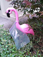
On May 25, 2013, I woke up to find I had been "flocked." 

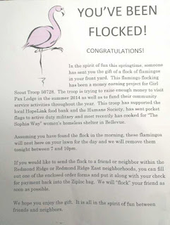
For those not familiar with "flocking", it is an excellent way of fundraising with no waste and relies solely on volunteer labor.  In our neighborhood, the flamingos are placed by a local Girl Scout Troop who arrive at a home after dark to arrange a prepaid number of pink birds on the front lawn of an local address designated on a form (see photo at bottom of page) filled out by a previous Flockee.  Included in the group of flamingos, is one large specimen with a plastic bag attached.  In the bag, is a letter (see photo) and form which will enable the recipient to surprise "flock" another person(s) of their choosing. The birds will stay until 7-10 pm that night and then the Girl Scout troop will pick them up and place them at the next destination.

Even though we do not get to keep the flamingos, I found this to be a creative way to raise money and a cheerful way to start the day.  I've seen various flock sightings in the neighborhood, some very creatively placed flamingos peeking out of bushes, interacting with each other,  and in my case, eating weeds (In my defense, there has been a LOT of rain the past few weeks. Okay, and yes, I tend to be remiss in certain landscaping duties. If only the rabbits that plague our yard would eat weeds instead of any plant that costs over $5!).


Tuesday, May 14, 2013

Lesson: Elementary Class Group Abstract Painting Based on Jackson Pollock


This was a great end of the school year Art Smart lesson for a 5th grade class. We looked at the paintings of Jackson Pollock and then had the students take turns in groups of 4-5 and spent 5 minutes each at the canvas.  Tools used were sticks, brushes and paint filled bottles. Paint: Tempera. Support: Gessoed stretched canvas (bought as stretched canvas but may be less expensive if you do it yourself).

Finished painting was donated to the school as a "farewell" present from the graduating 5th grade class but project could be done as a "thank you" to a teacher, parent, etc.

Recommendations:
     
  • Give parents a day or two notice about this project so that kids can arrive wearing old clothes (and shoes). Tempera will stain (and if using acrylic, hardens quickly. Rinse immediately).
  • We used tempera paint but if you have access to acrylic, I would use that instead.  Tempera has a tendency to crack if applied too heavily.
  • Prepare a space in advance where the painting can lie flat and undisturbed for 1-2 days.
  • Have at least 2 (3 is better) parents/docents on hand.  One to man the paint refill station. One to closely monitor the group at the painting.  We had one child while the docent's back was turned take a large brush and write his name in 18" high letters on the canvas (luckily we had enough time to paint over it before the class end). Also to watch for kids that tend to get carried away with gestural strokes  and need to make sure inadvertent paint fights aren't started.
  • Also have drawing materials out for the kids not currently in the painting group so they have a way to occupy their time.
  • Use 5 or fewer colors. Suggest one color per each student in each group.
  • If I were to do this project over again, I suggest use the 3" brush only at the very beginning to cover the surface and then use the sticks/bottles. Otherwise, some of the detailed drips and spills may be painted over with the large brush later on.


Tuesday, May 7, 2013

Columbine Illustration using Adobe Illustrator and Real Colors (Kindle Fire app)

My last post discussed generating a limited color palette in Adobe Illustrator based off of 5 dominant hues in a photo imported into Real Colors (an application on Kindle Fire).

After opening Illustrator, I entered the RGB numbers from each color and saved all five swatches in a customized palette. Using the colors from RC (and their tints/shades), I created the illustration below.

All in all, I found it an interesting way to increase one's color knowledge - especially as an artist, there are times when certain hues reappear in our work (I know I often get in a color rut without realizing it).  This was a great way to force myself to a limited and new palette. 

Real Colors also works with the camera on the Kindle Fire device so I can take pictures on location - a nice, easy way to capture color information locally.
Columbine illustration (Adobe Illustrator). www.christinemusser.com
 

Thursday, April 25, 2013

From Pencil Sketch to Digital Illustration: Columbine Study

Too nice a day to stay inside so I decided to work in my garden. Saw that the columbines I planted 7 years ago are still reseeding and in bloom again. I always found this particular flower to have such an interesting form - thought it would make an good subject for a digital illustration.

Over the next few days the plan is to photograph the flower and import it into Real Color (which will generate a RGB color palette featuring the 5 most dominant hues) and then scan today's pencil sketch into Adobe Illustrator CS5 as the base layer on which to build my illustration. I'll use the 5 colors (and resulting variations) produced by Real Color in Illustrator and see how the RC palette looks when applied to a drawing.

Thursday, April 18, 2013

System 96 Reactive Glass Experiments pt 2: Blue Topaz, Chambray Opal, Payne's Gray, Cobalt, Turquoise, Opal


My shipment of the new System 96 colors (Chambray Opal and Payne's Gray) came in a few days ago and was excited to try them out. Curious to see if they have enough copper to react with red reactive glasses.  As you can see in the sample (Reactive clear top layer extends to red line. To right of red line is clear 3mm glass) below, the answer is "no"...however, they do fuse very nicely - lovely, subtle colors.  I can see using these two in the near future with Pewter and Charcoal opal. Some interesting reactions occured with Turquoise stringers and 24 gauge copper wire producing strong dark red outlines.


Another relatively new color in the System 96 line, Blue Topaz is a cathedral glass that is supposed to have a high copper content which would produce a strong reaction. Oddly enough in my experiment below (top 1/2 clear glass, bottom 1/2 reactive clear), it had little color shift.  It may have been that the elements I had placed in between the top layer and the blue glass might have effected the reaction. I'll have to try this again without inclusions (copper wire, white and cobalt confetti) and see what happens. Beautiful color, especially when light passes through it.


Sunday, April 14, 2013

Artist of Note: Philip Worthington, "Shadow Monsters" at Seattle EMP: Interactive Art Meets Technology

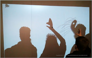
Recently, I had the pleasure of seeing the Shadow Monsters installation at the Experience Music Project in Seattle.  Shadow Monsters is the work of Philip Worthington, a British artist, who creates shadow puppets that are altered by visual recognition software.  When a person stands in front of a large light box, a shadow puppet is projected onto a large screen only the images change with movement. Eyes appear in closed counter spaces, moving noodle-like appendages grow from heads, and fangs appear in open angle areas (such as a hand with thumb and fingers at 45 degree angle).  Sounds were also written into the program, such as growling noises for creatures that have open jaws (as in the first photo).

I have to say, I'm not sure which was more interesting to watch...the shadow puppets or the people as they watch their shadows being transformed on screen.


Friday, April 5, 2013

Wonderland Prop/Set: Completed and Installed. Papier Mache, Acrylic Paint on Board, 2013


Wonderland prop completed and installed, April 3, 2013.

Some changes that I ended up making from the original concept sketch:

  • Instead of two large front panels (4x4') and a side panel to cover braces, I decided to do four panels (3 front, 1 side). Was easier to transport to stage in my car without damage.
  • Fewer details in the background painting. Left as more gestural/abstract to let the papier mache work stand out and also not to detract attention from the actors.
  • Decided to reuse some of the left over tissue from the acacia tree prop as grass accents near the papier mache rock border.
  • Rocks were added once the prop placed on stage (final position). Attached button shanks to unseen side and strung the rocks together in four lengths through the shank holes.  After strung, rocks were attached to foamcore using zipper pull findings (which were fixed to the foamcore using 24 gauge steel wire).


www.merrikindesigns.com/costumesprops.aspx

Sunday, March 31, 2013

Wonderland Prop: Papier Mache Flower Armature Construction (Roses, Tiger Lilies, Daisies)

With the lattice and rocks complete, time to begin work on the floral pieces (roses, tiger lilies, daisies).

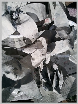
Using tin foil, foam, duct tape, 18 gauge wire, and poster board, the flower armature takes shape by adding one petal at a time. If an organic feel is desired (and depending on the size of the petal), the base can be left as posterboard rather than covered with duct tape before the paste is applied. Slight warping will occur but it does help to give the flower a more natural feel. Also, I find it best to place the flower face down in a bowl and apply the paste to the back first which will help the petals maintain a flared form.

Today is the last day for the papier mache portion - need to prime, paint, and deliver in about 30 hours. I plan to start painting the background while the flowers are drying to make the best use of my time

Tomorrow's photos will feature the background painting and final piece.


Friday, March 29, 2013

Wonderland Prop Progess: Paper Mache on Individual Components

I am very glad to see the sun out this morning (not a frequent occurrence in the Pacific Northwest I assure you) otherwise I would be hovering over the papier mache parts of this prop with hair dryer in one hand, fan in the other, and vigorously blowing with as much hot air  I could muster out of my lungs to get it to dry as fast as possible. Making progress however...my favorite part so far is the little pawn garden statuary constructed out of balloons, chicken wire, duct tape, and memory foam (with papier mache on top layer). Another photo to come tomorrow.


Wednesday, March 27, 2013

Wonderland Garden Scene Prop, Papier Mache

A new stage set/prop project begins! This is a garden scene for Wonderland which is a modern adaptation of Lewis Carroll's Through the Looking Glass. The characters of the Rose, Daisy, and Tiger Lily will stand behind the prop.

I've already started making the rocks for the foreground but needed to resolve painted background area this morning in order to determine how many papier mache flowers will be needed.

Some of the plants will be painted directly on foamcore board supported by wire mesh and other parts, such as the trellis and roses/tiger lilies/daisies will be in 3/4 round papier mache. At the base in the front, the rocks will be placed to create a garden border effect.

Final to be in 3 panels due to size/transport issues and mounted to a 4x8 wood panel supported by three braces on back side

More photos to come in the next few days.

Friday, March 22, 2013

Fused Glass Earrings as a Result of Collaboration

A few weeks ago, I posted a sketch of an earring design my 11 year old son came up with...here is the first version in fused glass based off of his drawing. I made these as a gift for his music teacher. If you look closely, you can see small eighth notes within the glass.

Thursday, March 21, 2013

Favorite Art Related Books

Note: this post was previously listed in February 2013 - the link was failing so reposting again here.

If I had to list the books I reference most often for my artwork and for inspiration, it would look something like this:
  1. The Art Spirit by Robert Henri. A must read for all artists. I've had my copy since my days at RISD. Great inspirational work about art and life.
  2. Drawn to Life, Volume 1 and Volume 2. A recent addition to my library. Fantastic collection of lectures by Walt Stanchfield (master Disney animator - influenced the likes of Brad Bird and Tim Burton)- not just for animators but for anyone interested in drawing.
  3. The Thinking Eye and the Nature of Nature by Paul Klee. Klee - one of my top four favorite artists of all time (Wassily Kandinsky, Pablo Picasso, and Alexander Calder are the other three). I was very fortunate as a student to have a part time job at the RISD library. One of my favorite tasks was reshelving the books housed in the locked case section (hundreds of rare volumes, include first editions and handmade artist's books) which is where I discovered these books and would return on my days off to read at leisure. A few years after graduation when I was living in Seattle and in between jobs, I happened to walk past a bookstore that had a set in the shop window. Apparently, there was a limited print run in the early 1990's - it was the only time I saw them available in a store since. One of the best purchases I have ever made - although at the time since I was unemployed it was probably not the most practical expense (but I would do it again if given the chance!).
  4. Wassily Kandinsky's Concerning the Spiritual in Art. A call for abstract artists. Like Klee, Kandinsky was interested in portraying the inner life. Excellent read.
  5. Master Class in Figure Drawing by Robert Beverly Hale. Learning anatomy from studying the great artists through the eyes of one of the best instructors on the subject.
  6. The Artist's Complete Guide to Facial Expression by Gary Faigin. A practical reference book that I utilize often, especially for illustration and polymer clay work.

Monday, March 18, 2013

Lesson (Elementary): Introduction to Carving: Creating Totems in Plaster


Although this lesson takes some planning (plaster blocks should be made at least a few days ahead of time.  I had the 4th graders help me at the end of the prior month's class by mixing and pouring the plaster mixture into cut milk cartons (about 2-3" high, trimmed bottoms of 1/2 gallon milk containers), it is a great tie in to studies of Pacific NW Indian tribes.
For this lesson, I presented a slide lecture (pdf version of lesson available here) discussing the various animal totems along with examples of Native American carvings and basic introduction to sculpture (how is sculpture different than painting, how it depends on light to define its form, the importance of shadows, types of sculpture (subtractive), etc).  I gave them a homework assignment (after we made the plaster blocks as noted above) that listed the animals to choose from and at the bottom of the page, an empty 3.5" x 3.5" square.  In this square, they were to do a line drawing of the totem they wished to carve.
During the next art class, the students then cut out their 3.5 squares from their homework sheet and with a dulled pencil, placed their drawing face up on top of the plaster block and firmly traced over their sketch.  Then using a file, rasp, and flat head screwdriver, they began to remove the excess material and see their totem take form.
Unfortunately for our class, the school did not have available wall space when it came time to hang their work.  The display ideally was to have the students' totems mounted on chipboard with narrow margins and have then stacked vertically directly on top of one another to resemble a totem pole.
Be aware, if you are limited to a one hour class period, you may need 2 classes for all students to finish carving.  For most kids, it is their first exposure to carving - they loved this project.  You may want to check the drawings first to make sure they are not too detailed and able to be carved without frustration.

Thursday, March 14, 2013

Acacia Tree Prop: Completed and Installed

Number 1 rule for creating props/installations for theater: Always have a Plan B (contingency plan) for last minute changes.

In this case, I arrived at the school and found that the stage location had changed to allow room for the drummers.  Unfortunately, since the tree as it was laid out required 6 fixed points above to anchor limbs, this meant the tree had to undergo reconstruction on site since the center fixed point had shifted. With the center moved, this limbs to either side would no longer hang correctly (one side stretched out too far, the other side would not have enough room for the limb to spread out..

Luckily, I recently discovered double sided duct tape and was able to affix painted pieces of drawing paper and reroute some of the smaller limbs and cover the tears and new attachments with the duct tape. After which, I applied another coat of brown acrylic to blend in the tape with the existing papier mache structure.


Monday, March 11, 2013

Acacia Tree Theater Prop: Armature Complete

Six rolls of duct tape (reinforce wire structure and smooth out the hexagon shape of the wire) and two rolls of chicken wire later, the armature for the tree is complete.  Now to cover with papier mache...

Thursday, March 7, 2013

Acacia Tree Prop: Armature (Chicken Wire/Duct Tape)

Constructed out of chicken wire with 18 gauge steel wire and cable ties for joining section wire branches, the armature is about 40% complete.  Duct tape (and later plastic bags/kraft paper) applied over chicken wire to further increase support and smooth out the surface so that the pattern of the wire does not show through the papier mache.

Since there will be three stepstools at the base of the tree, the bottom four feet of armature (seen here as exposed wire. Duct tape starts at the 4 ft 1 inch mark). There is a height limitation with the ceiling in the garage where I am constructing the prop so the next stage will be removing the bottom 4 foot section in order for the second trunk segment to rest on the floor. This will enable me to build the upper branches so they reach the correct height when installed at the school.

Wednesday, March 6, 2013

Theater Prop - 20ft wide acacia tree in papier mache - Grid/Sketch

With the exception of tomorrow night's post which will be an art lesson for elementary students re: pointillism, the next few days will feature images and notes regarding the construction of an Acacia tree prop needed for a local elementary school production.

Sketch of Acacia tree over grid.

Here is a rough list of the steps I like to take in creating props:

1. Meet with the director and discuss the needs for the production. This includes overall look, size, color, budget, and deadline.
2. Make a few sketches to run by the director to verify the prop you intend to create has the look and feel that they also had in mind.
Grid in Photoshop of area where prop
will be installed
3. Take measurements.  Take measurements again. The old adage "Measure twice, cut once" applies here.
    4.  I like to take photographs of the setting and then create a grid in Photoshop to fully visualize the space (top photo).  I then attach a sheet of tracing paper over the grid photo (tracing paper as it is thin enough to see the grid underneath) and sketch the prop to scale (bottom photo).  This tree will be one of the larger props (20 ft w x 10-12 ft h x 4-5 ft deep) I have done (www.merrikindesigns.com/costumesprops.aspx to see the pirate ship which is the largest at 30 feet in length)

Tomorrow's post: Creating the skeletal framework.

Wednesday, February 27, 2013

Collaborative Art Projects with Kids

My son, Ernie, gave me a sketch this morning and suggested it would make a great earring design - and then asked if he could make money from the sale if I used the design based on his drawing.

Actually it's not a bad idea...might be a good way to encourage creativity, learn to work with others, and give a means of earning extra money through work efforts.  And to encourage saving, I have offered the following deal to my son: Receive 25% of the gross sale if the money is wanted now or put the money in savings for college and earn 50%.

Today's page from my sketchbook features Ernie's original drawing (upper left), a modified drawing with notes on possible design changes and then a rough polymer clay version. Not sure if I will keep as polymer clay or try a version in fused glass...but will post a photo of the final earrings in a future post.

Saturday, February 23, 2013

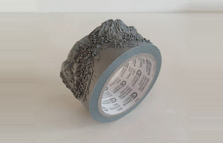
Artist Takahiro Iwasaki: Art from Ordinary Objects - You'll Never Look at Duct Tape the Same Way Again

Iwasaki.www.thisiscolossal.com

Iwasaki.www.thisiscolossal.com
 
Iwasaki. www.thisiscolossal.com
Or look at thread from a towel and toothbrush bristles in the same manner either for that matter.  Amazing what Takahiro Iwasaki can create from everyday objects.  I can barely thread a needle without squinting - can't begin to imagine the eye strain involved with constructing a ferris wheel from sewing thread. Never would I look at a roll of electrical tape and think it a worthwhile carving medium yet Iwasaki creates a topographical map from one.

For more images of work by Iwasaki, see Colossal, a blog started/edited by Christopher Jobson (Chicago, IL) that focuses on non digital art (in many forms) with roughly 20-25 artists featured each week. A worthwhile read.

Friday, February 22, 2013

Artist of Note: Emily Haworth of Etsy shop, By Beep

E. Haworth from Etsy.com
Emily Haworth, Illustrator and Jewelry Maker (Chicago, IL)

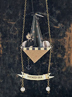
An artist after my own heart. I love her ingenuity and curiosity to see where her art takes her.  Emily Haworth, a Chicago based freelance illustrator and jewelry maker, creates intricate and playful wearable paper sculptures.

Take a look at this interesting artist (love her paintings too!). She can be found at www.emilyhaworth.com as well as on Etsy under the shop name, ByBeep.

See here, for Etsy blog article about Emily Haworth's work and more images of her whimsical works.

Journal kept by E. Haworth from Etsy.com
The Wicked Sea by E. Haworth from Etsy.com
Since then, jewelry-making and I decided to get to know each other better. I started creating pieces of jewelry with no direction or purpose other than to see what I was capable of. This is the greatest lesson I learned as a beginner — to explore all the ideas in your mind no matter how different they are from each other. Eventually, you will create a piece that connects with you in a special way and you’ll say, “This is it. This is the direction I will go.”  - Emily Haworth

Thursday, February 21, 2013

Rag Doll Polymer Clay Switchplate Cover - Finished

Rag Doll, Copyright 2013 by C. Musser, Polymer Clay on
Nylon Switchplate
Took a little while longer than I anticipated, but here is the polymer clay version of the rag doll switchplate cover sketch from last week.  Button eyes came from a fabulous button mold from MoldMeShapeMe on Etsy.com.  Hair bows came from a high quality silicone mold from Etsy shop, MoldMuse.

Loved working with the silicone molds with polymer clay - just mist the mold with water and the poly clay comes out with ease.  Also, it is possible to bake polymer clay in the molds themselves since the silicone will withstand the heat of the oven.

Working with silicone molds makes me want to try creating my own molds for frequently used polymer clay components - I suspect there shall be a post about this in the near future.

Original sketch for Rag Doll can be found in this post (February 13, 2013)